In the summer of 2016, I was honored to be selected for a design job offer working as a visual Design intern at Adobe NYC office. My role was to assist my design mentor — Tim McEvoy (Sr. Experience Designer) with a given project to redesign parts of the interface with Spectrum, a new styling language for Adobe Marketing Cloud software, and tackling existed problems based on users’ feedback.
My goal was to design a conceptual prototype that would provide a better user experience to customers in the future. In order to complete this task, there were three major directions separated in my redesign project such as simplifying interface layouts based on the hierarchy of primary and secondary elements; solving problems to banish confusion by providing a smoother workflow; as well as enhancing user experience by improving its functionality.
Adobe Summer Internship
UX/UI Design
2016

Adobe Audience Manager, one of the Marketing Cloud software (also known as Marketing Cloud solutions), is a data management platform that can be used to create profiles of audience segments. In other words, it helps you build unique audience profiles so you can identify your most valuable segments and use them across any digital channel. These profiles can then be used for targeted ad campaigns or other marketing purposes.

Process
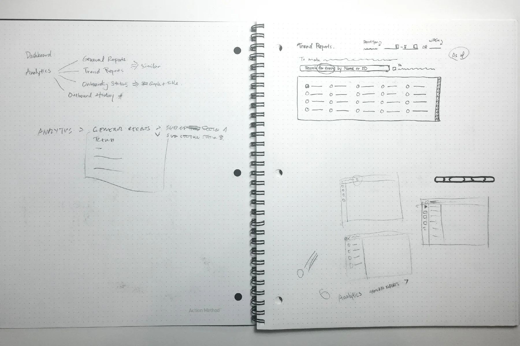
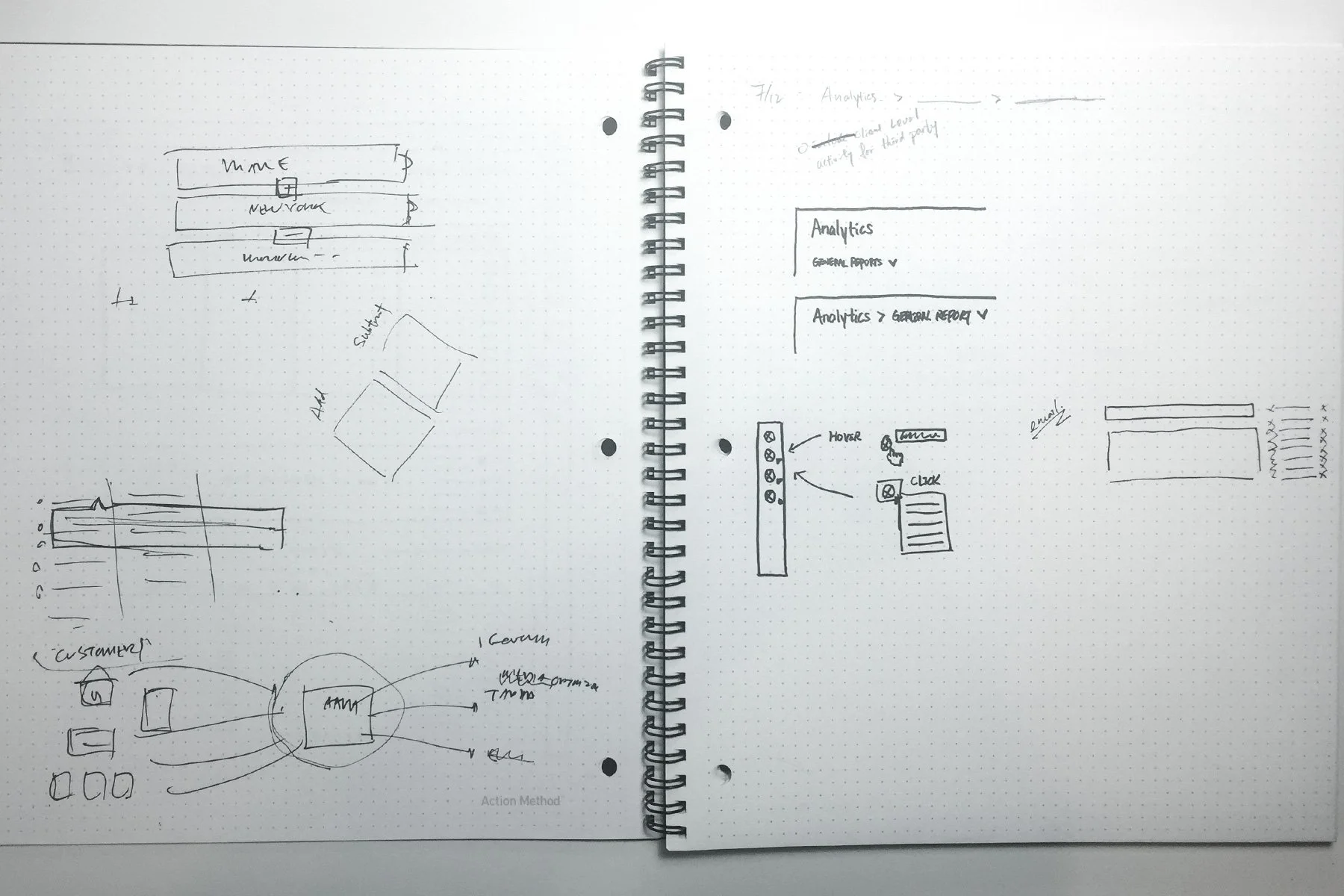
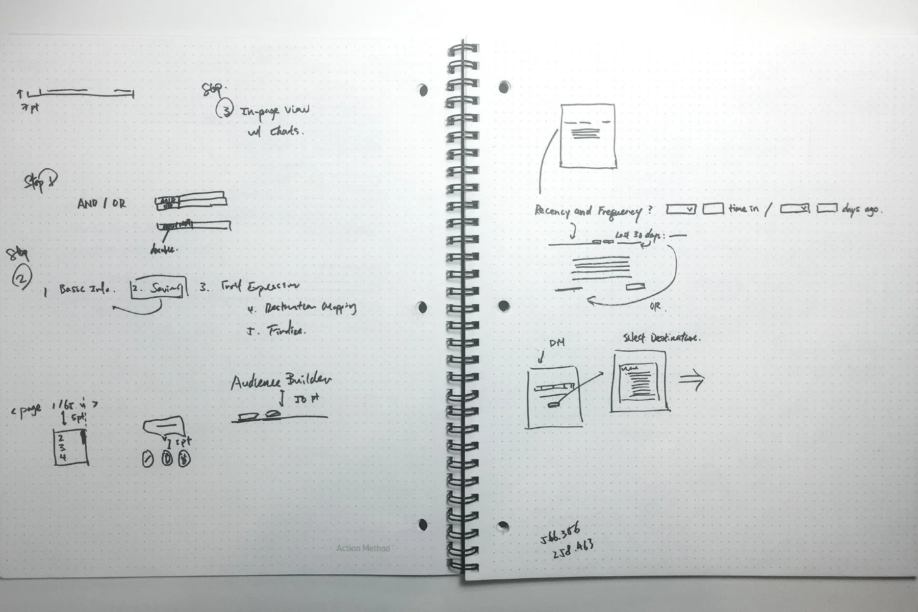
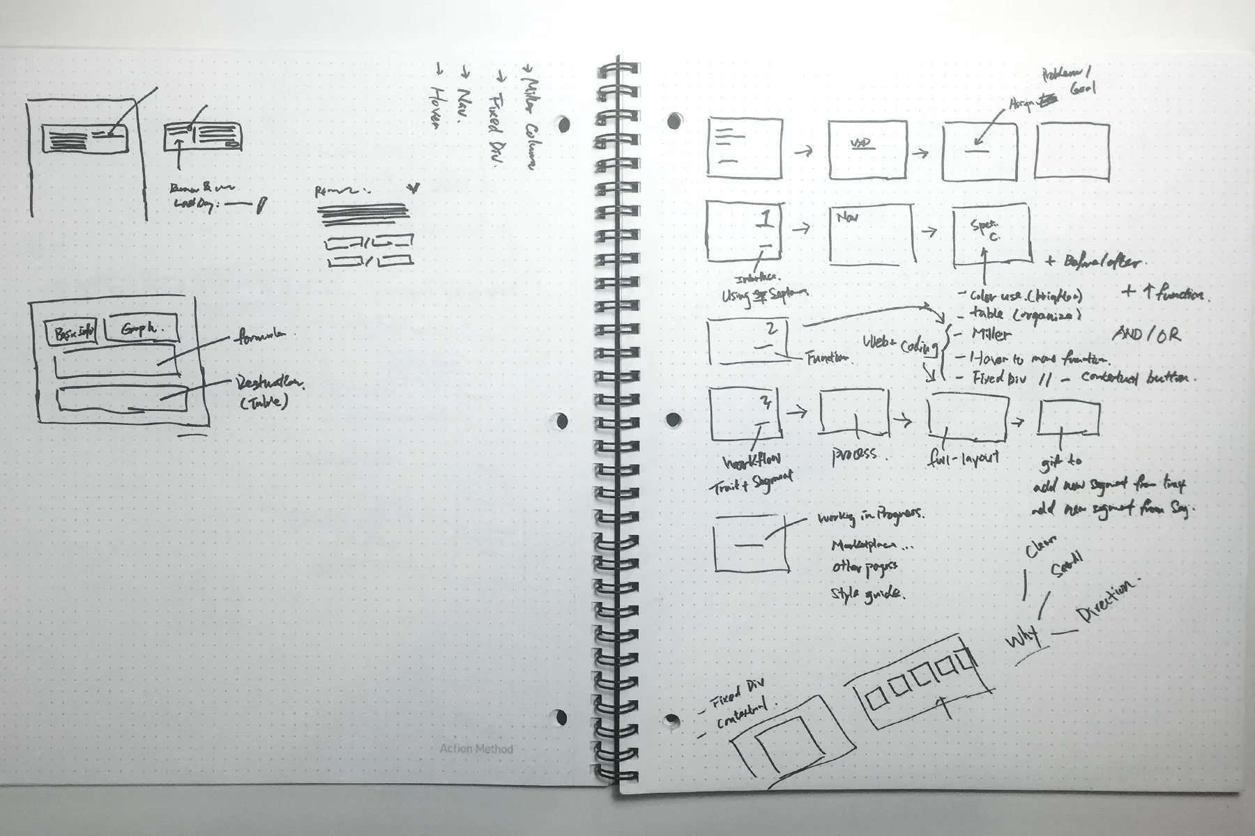
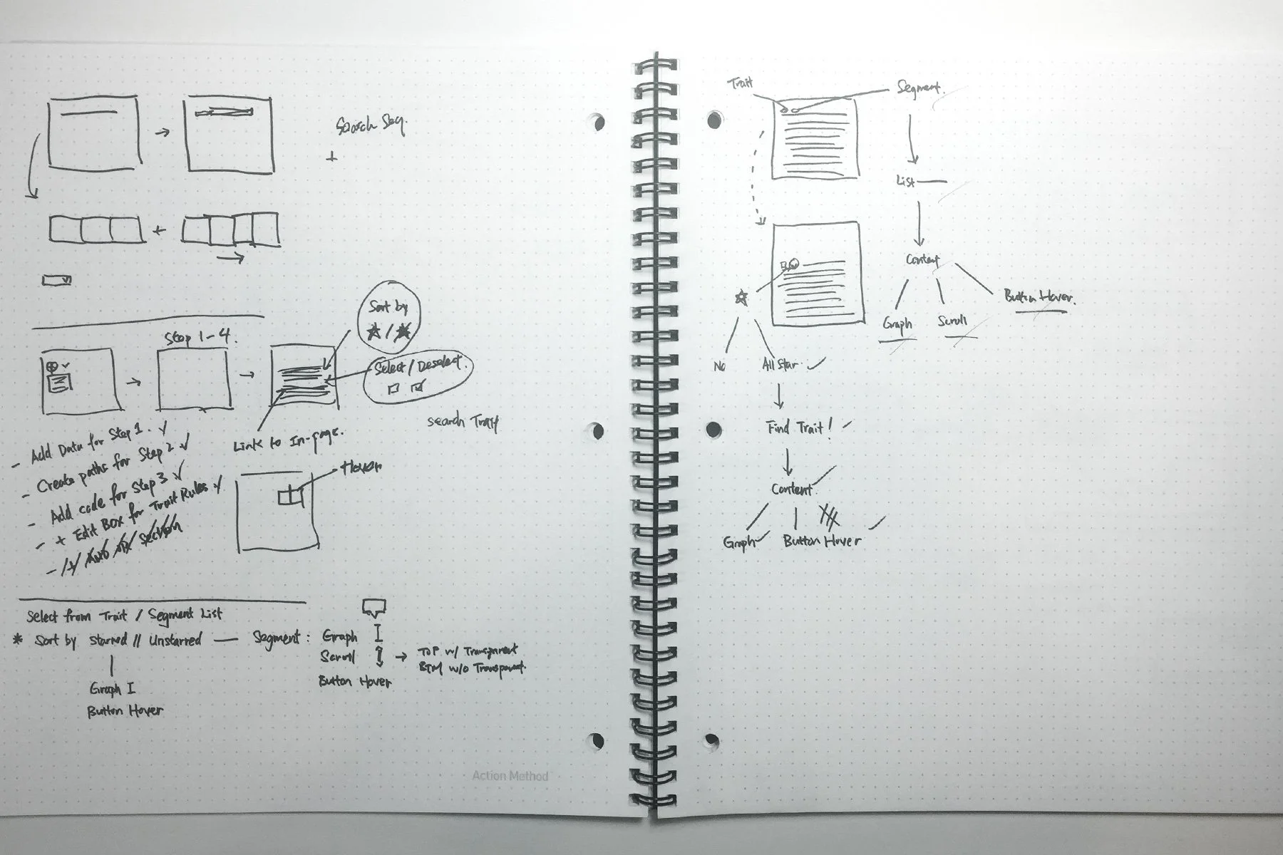
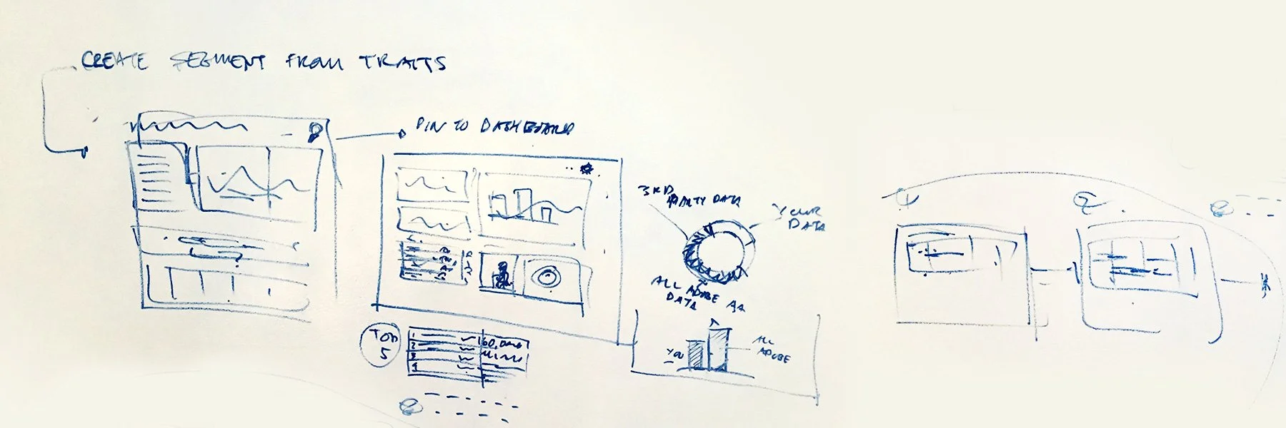
To achieve this redesign challenge, I started analyzing and thinking about the possible methods to improve this software by printing out the screenshots of the current AAM interface and marking down the details that I would suggest with alternative approaches.
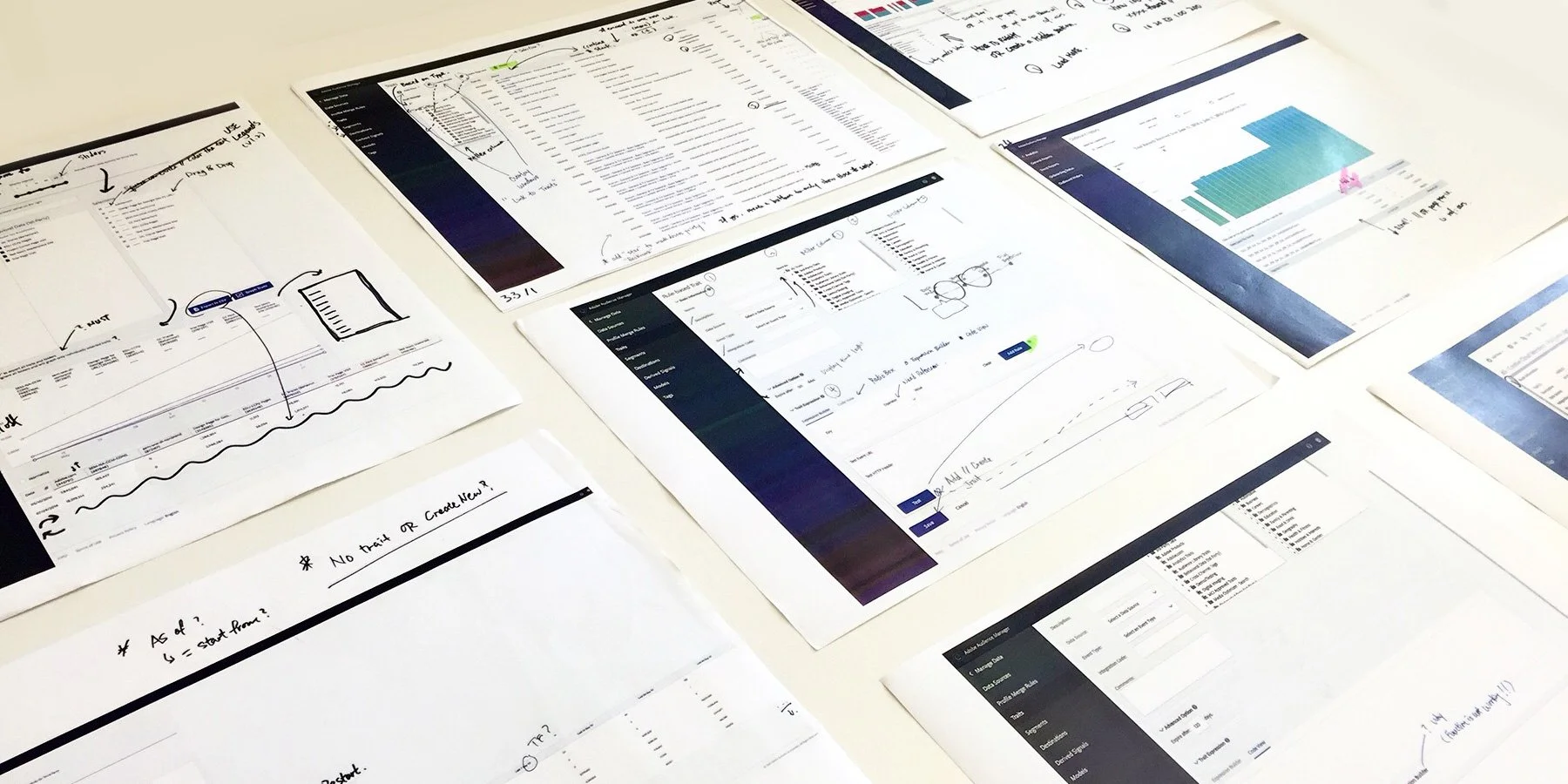
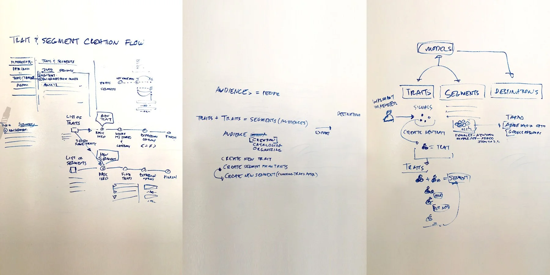
In addition, I made hand sketches and rough digital sketches to help visualize the wireframes and chose one from all of the attempts.


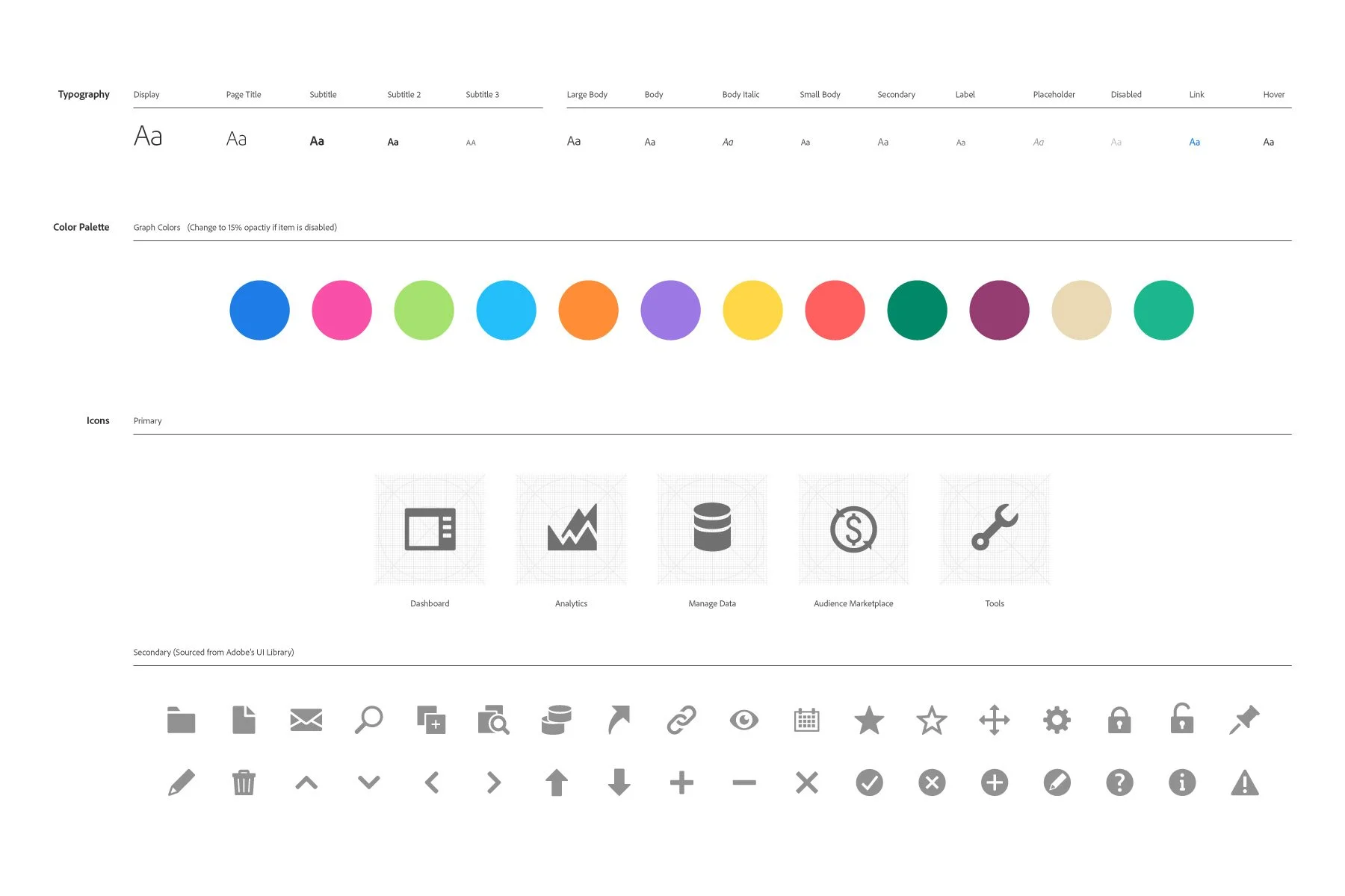
Styling Development
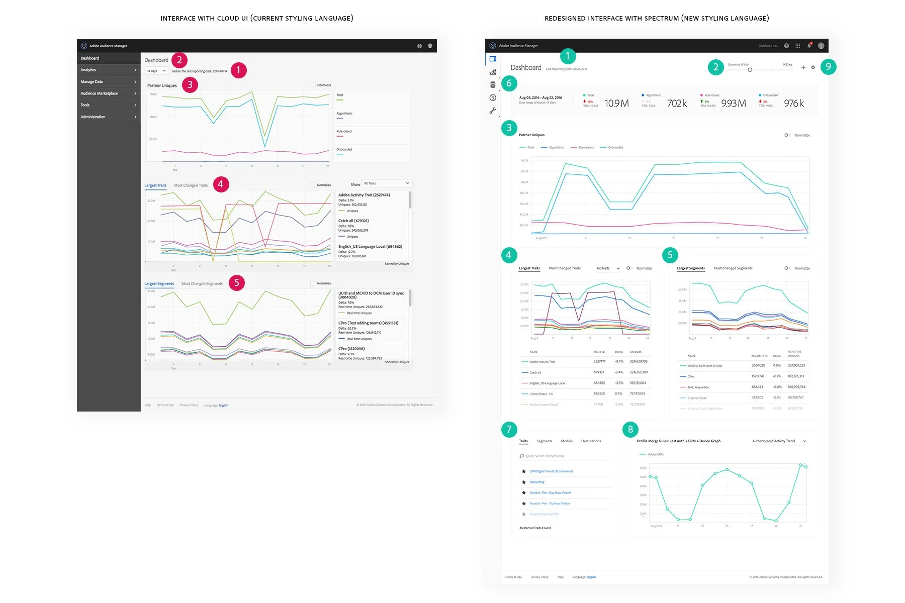
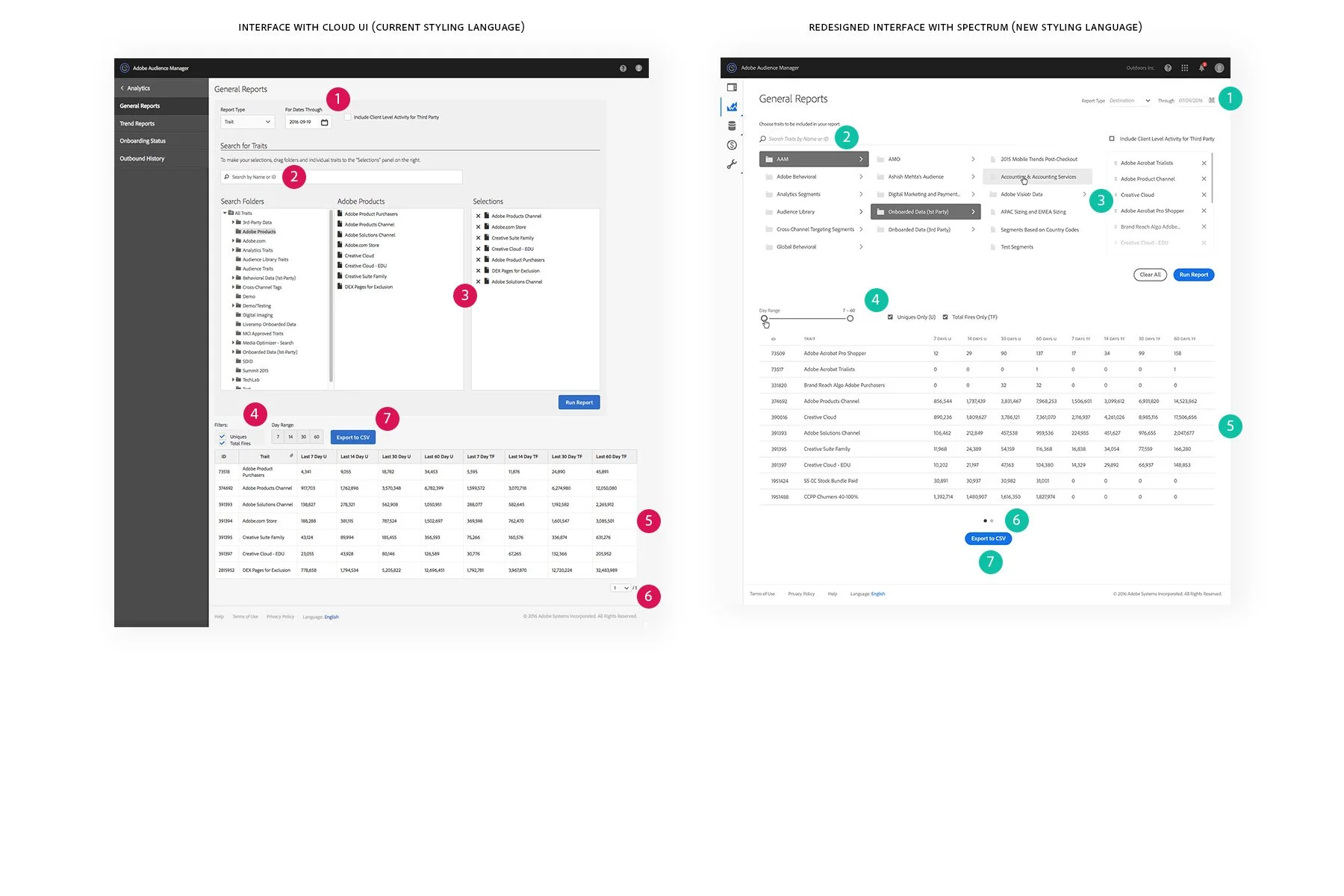
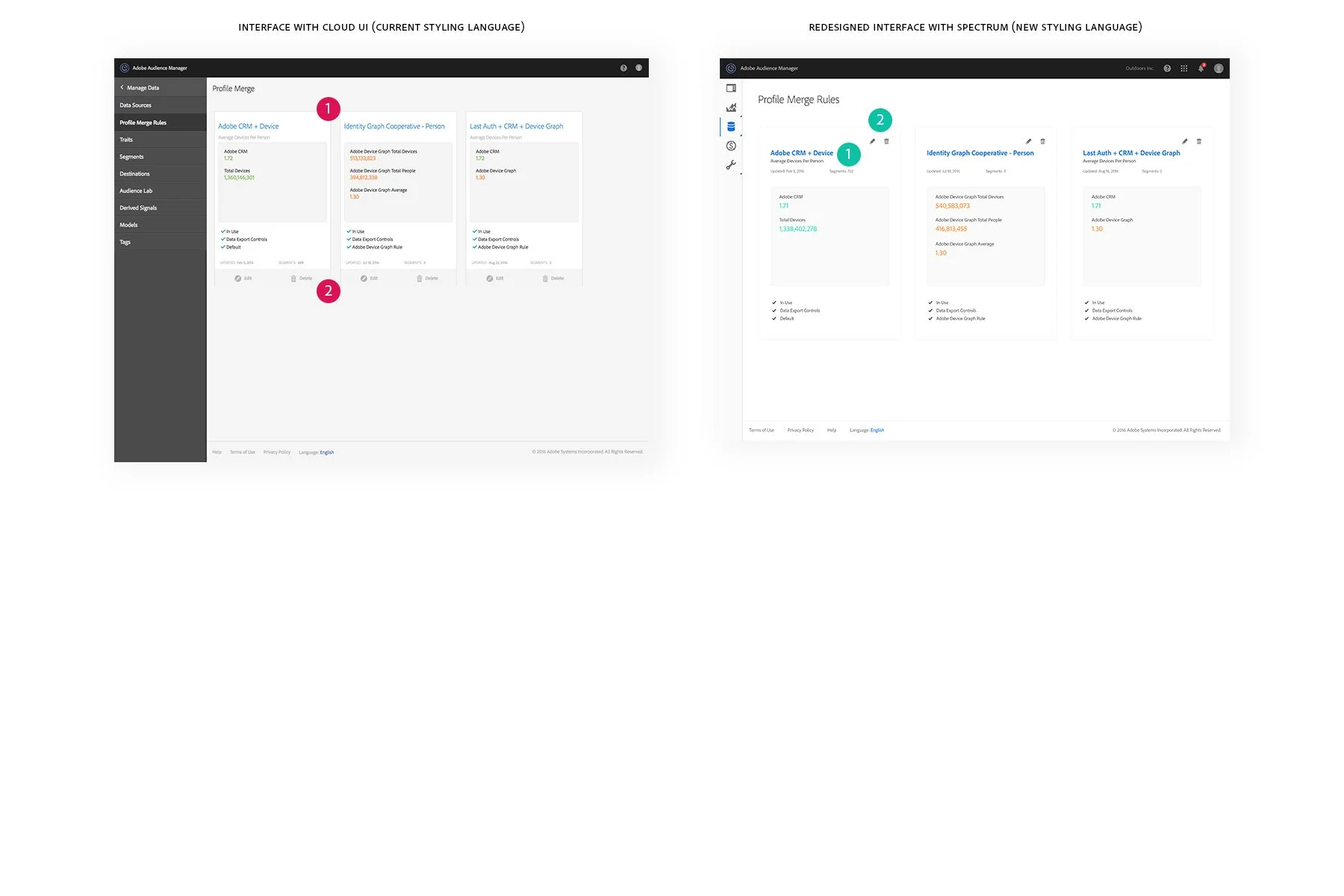
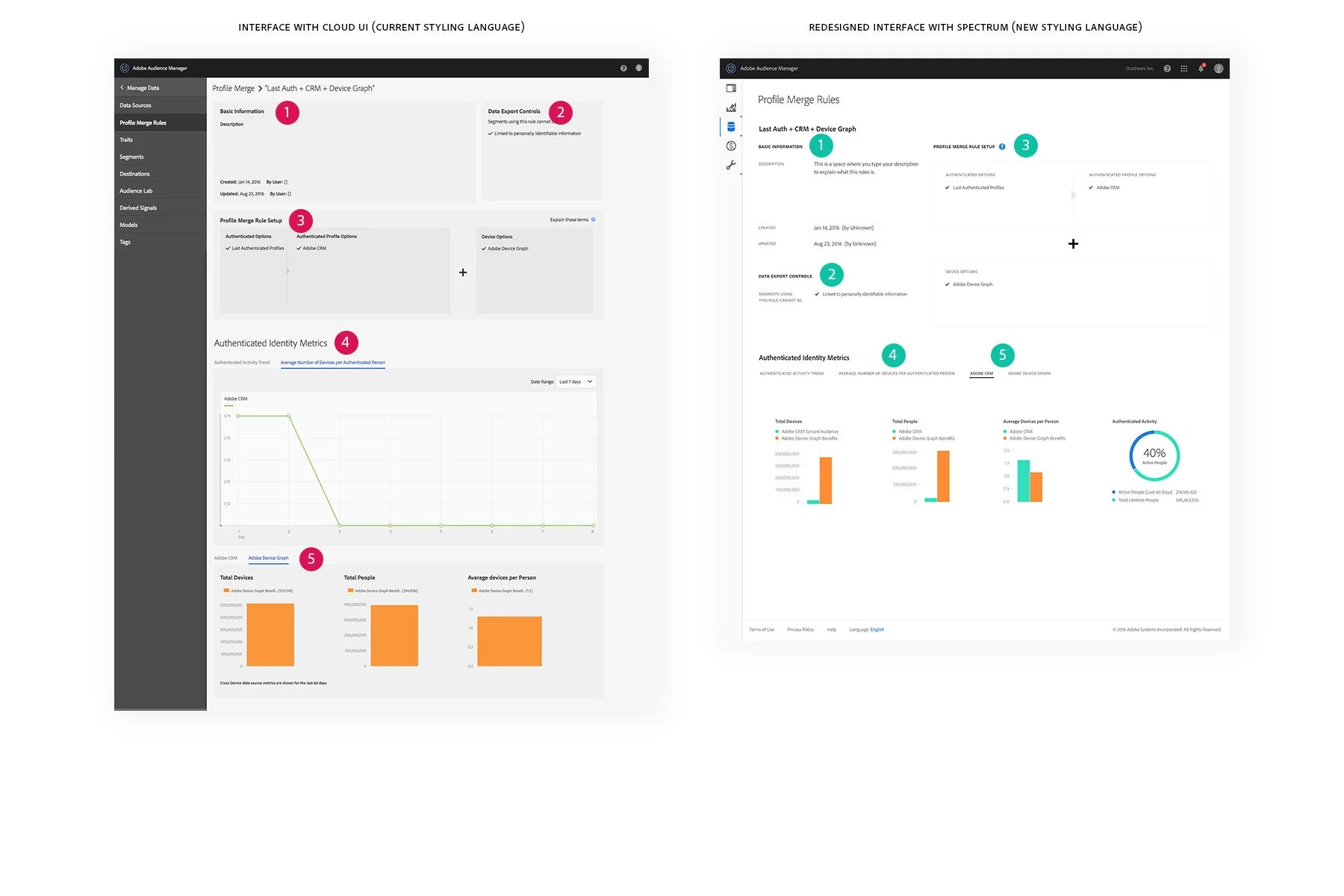
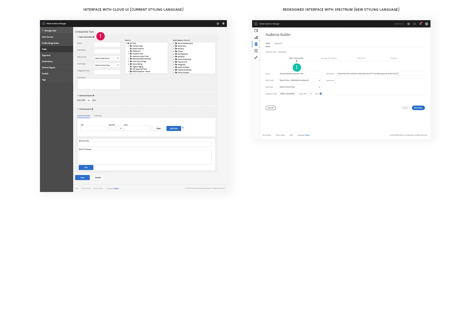
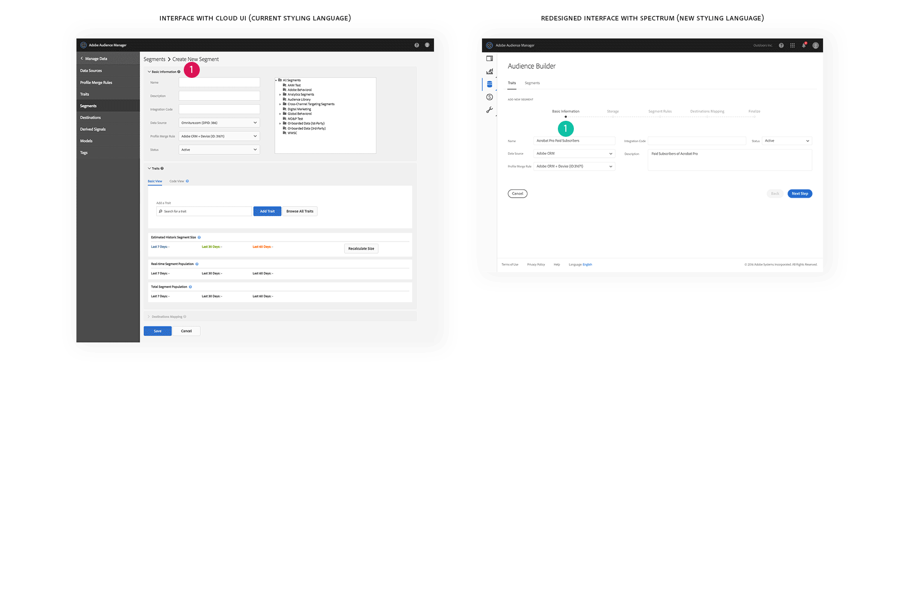
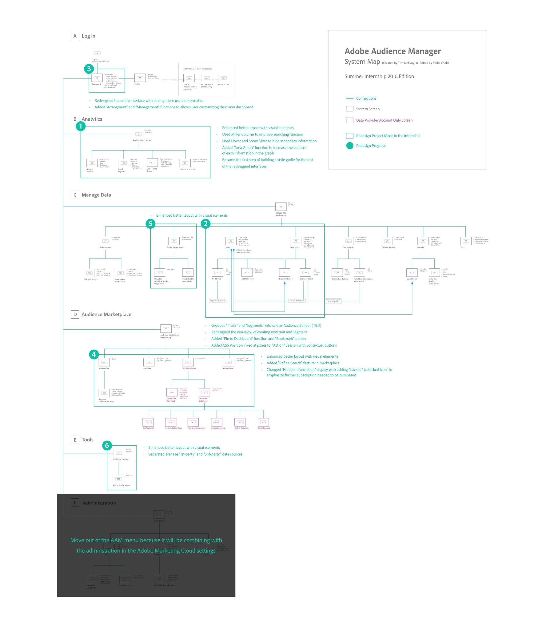
Beginning with redesigning reports in Analytics, I built up a visual style guide referencing the Spectrum UI kits. These styling rules were also applied to the rest of the interface due to consistency.
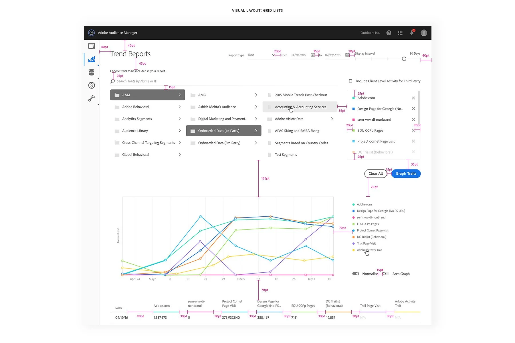
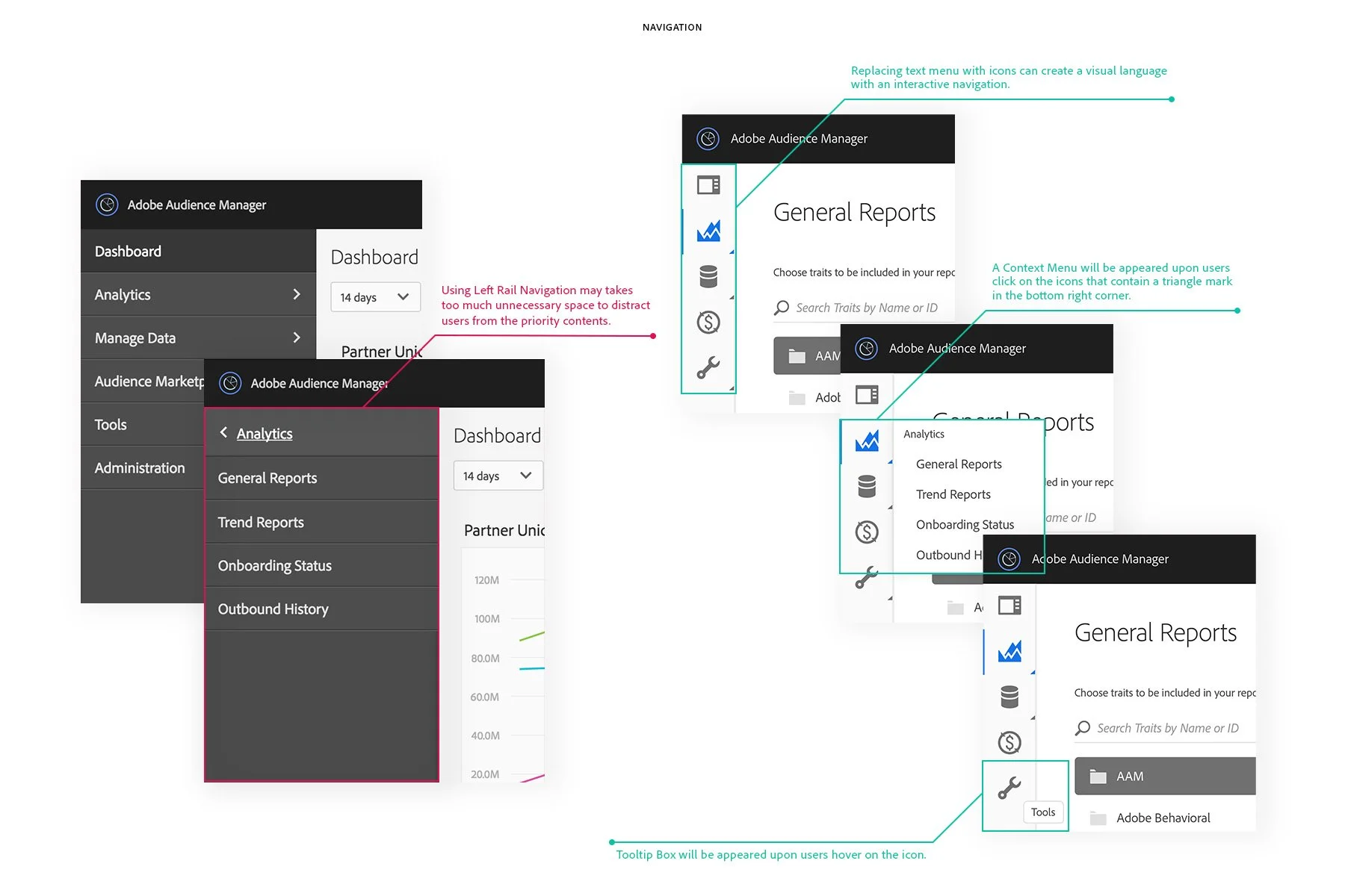
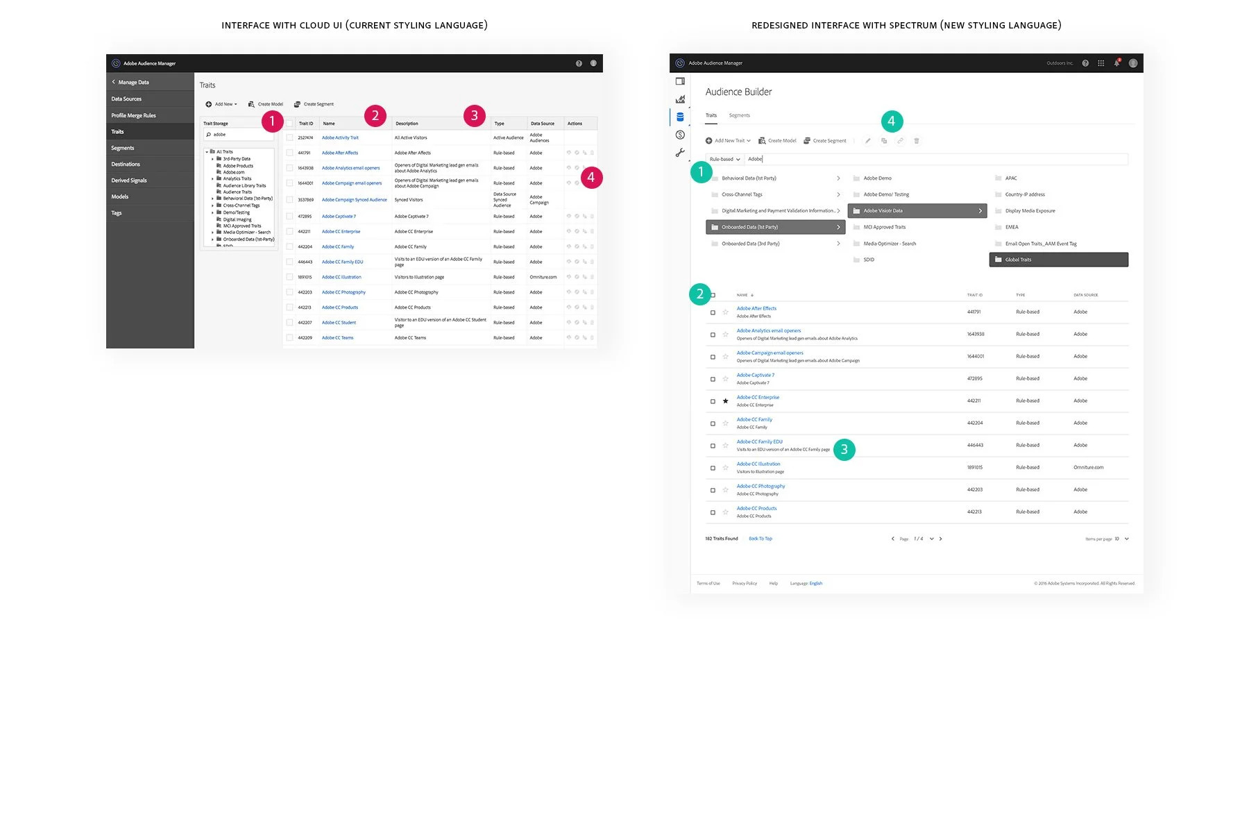
The proportion of the Navigation becomes an obvious problem to users as it takes over too much space with many text on the navigation to distract users from the main content of this software, especially when Data and other informative text should be the priority for users. In this case, I would suggest using icon navigation with tooltips to create a visual language to users, especially for people who are not native in English. And it also helps minimize the use of space in the interface.
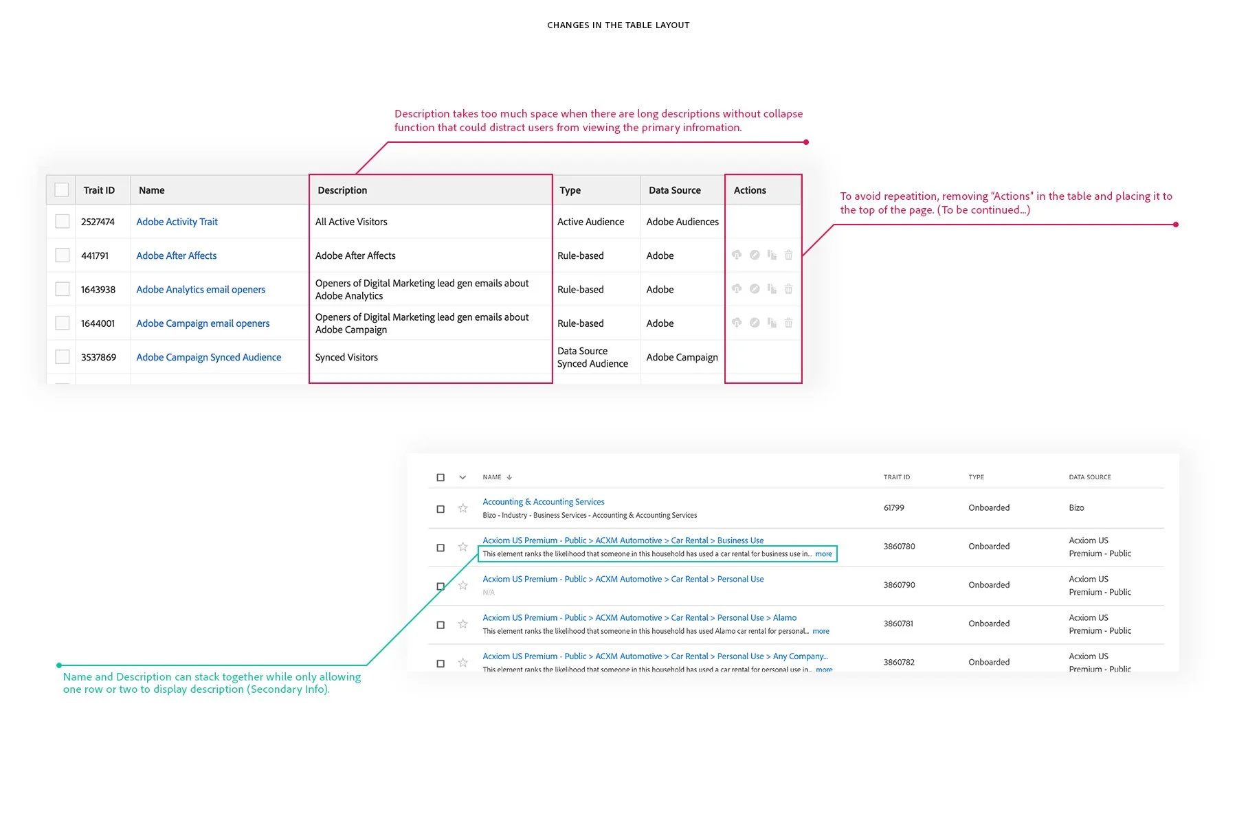
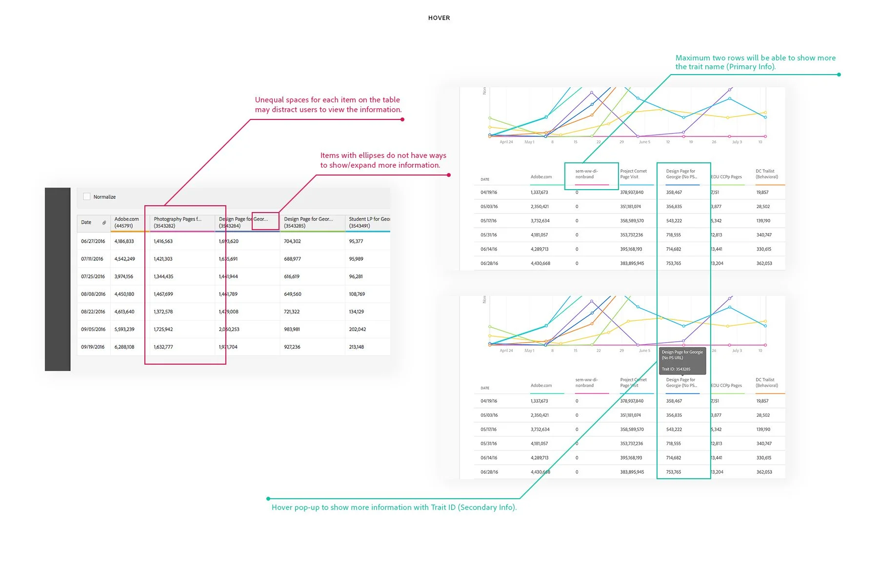
Additionally, users are always overwhelmed by the amount of content being exposed at a time. Since less percentage of users find their items based on the description, with considering description as a secondary info, I think to put under each of the item name would be an appropriate treatment to enhance the visual experience of the interface.
Functionality Enhancement
Since Audience Manager is a web-based software, adding more web coding features such as Javascript and CSS could help boost its functionality to bring a greater user experience.
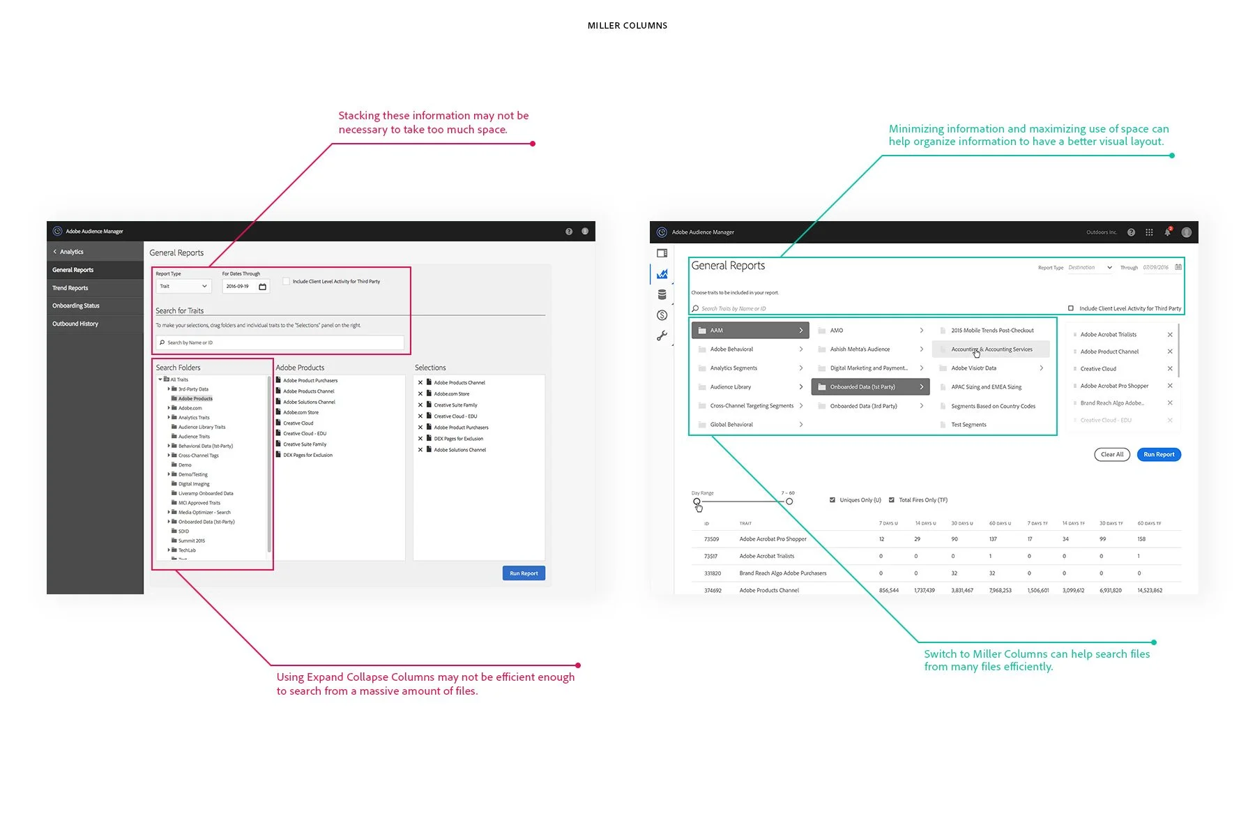
Replacing Expand Collapse menu with Miller Column in search is more clear and more efficient in terms of the user experience since it is relatively easier to use when you have tons of Data on a page.
Using hover to show the detailed info of the item can avoid having too much info showing at a time.
Making interactive actions with coding can avoid unnecessary repeats. For example, the action bar is used as "position fixed on top" when scrolling down at a particular pixel. Also, there are contextual buttons on the action bar will only be enabled when the user takes actions to select one or more items.

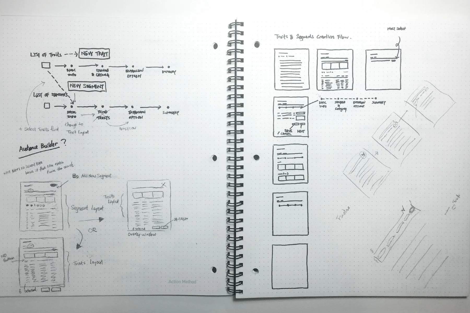
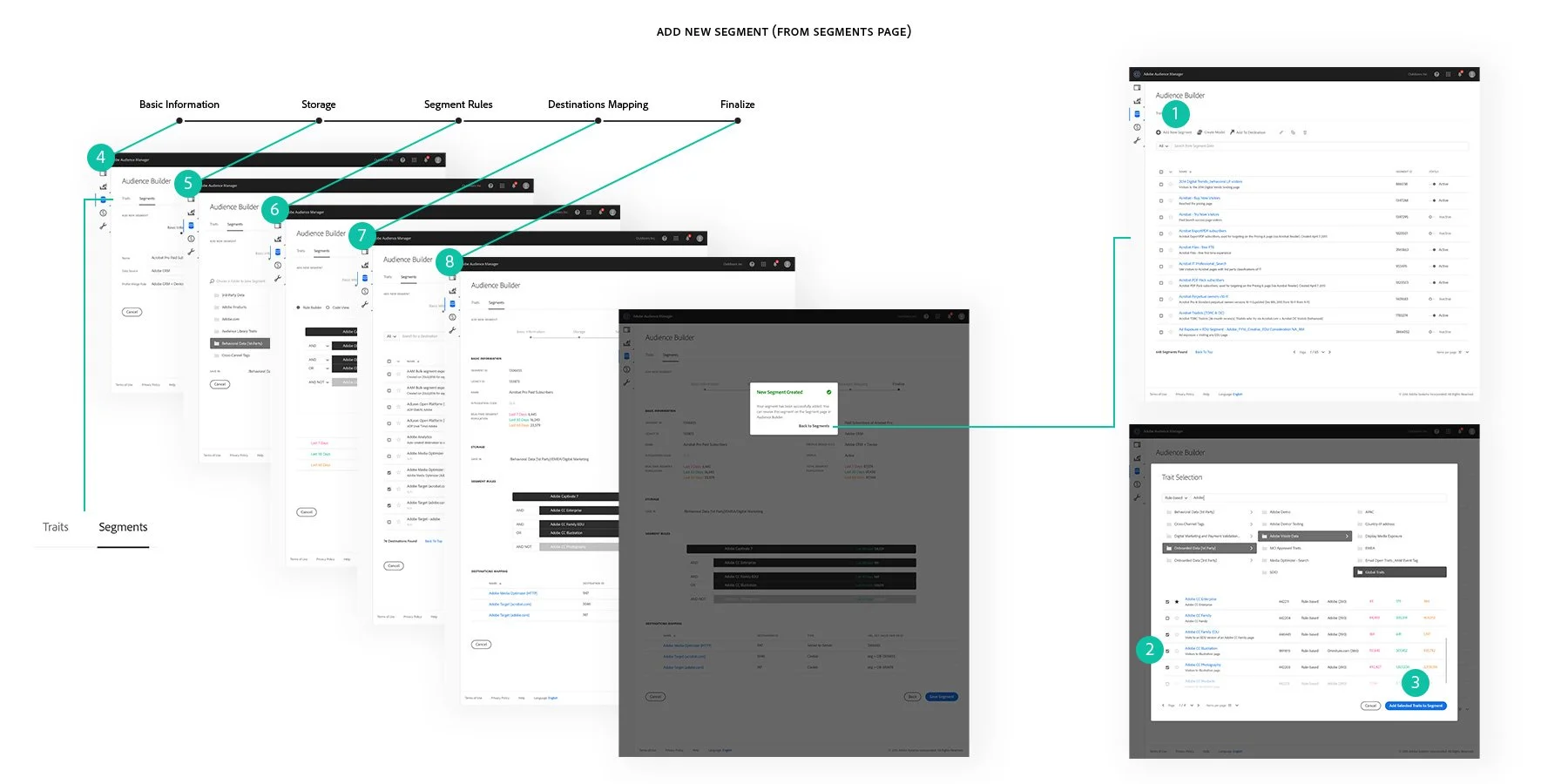
Segment Creation Workflow
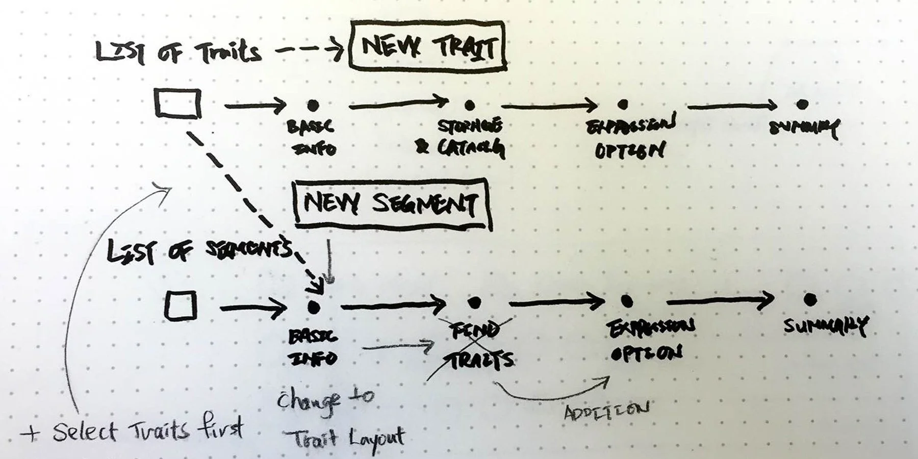
Based on the users’ feedback, one of the major problems in AAM is the current workflow of segment creation.
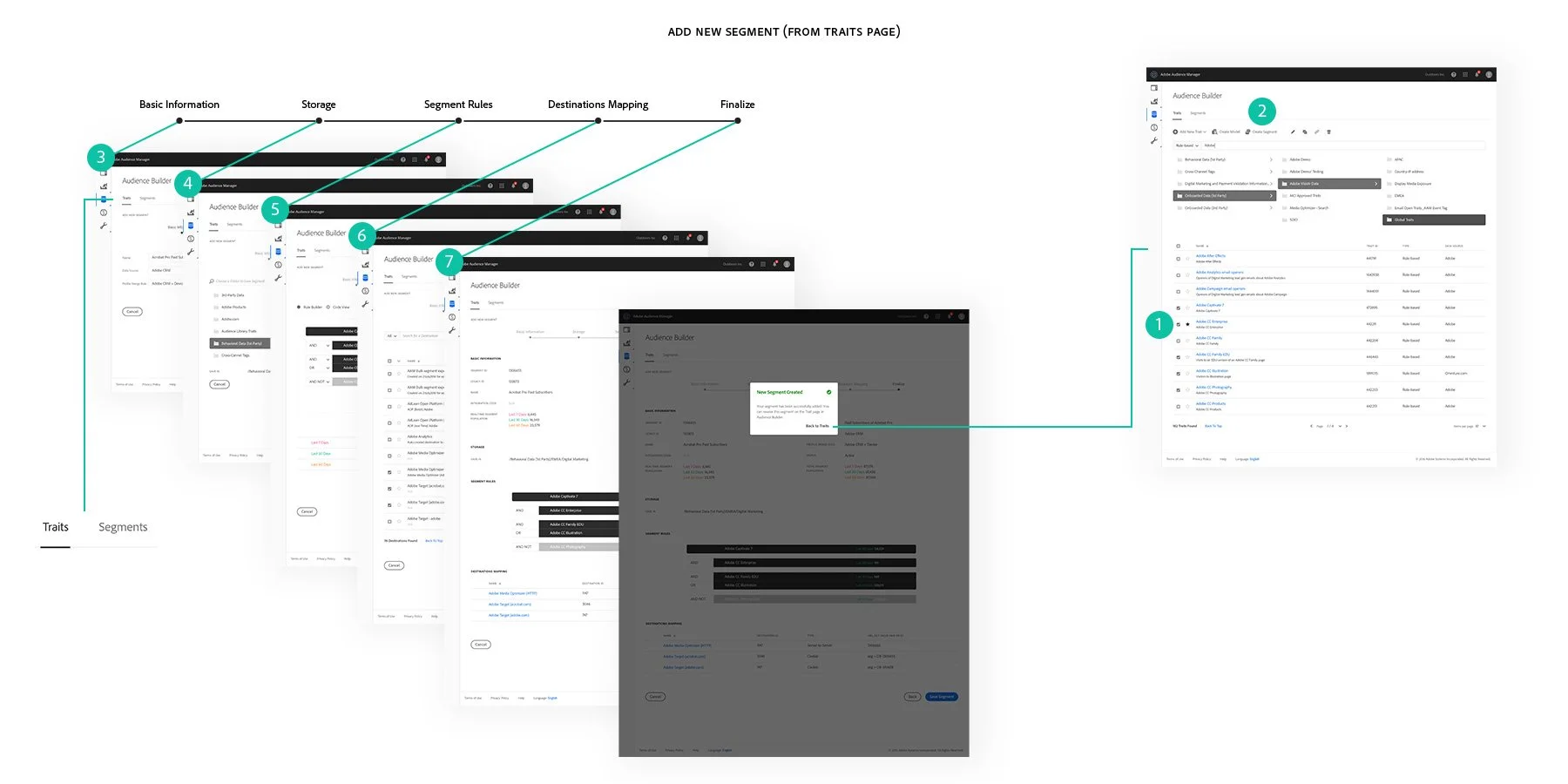
The first problem is the "Add New Segment" features on both the Traits Page and the Segments Page, but the workflow of segment creation will end up going to the Segments Page after the setting. In that case, users can be confused when they do not realize it has been changed from the Traits Page to the Segments Page since both of the pages have similar layouts.
The second problem is users may feel lost when they try to find traits to build segments from the Segments Page because the sequence of adding a new segment is not the same as creating it from the Traits Page.
In that case, after discussing with Tim, we came up with a solution that adding a pop-up overlay window before going to the "Add New Segment" page can prevent the confusion caused by the current version. On the other hand, to help avoid confusion or missing fields, using Wizard as guidance through each step is effective to point out a clear direction with the logical step process for users to create their customized elements in the settings.
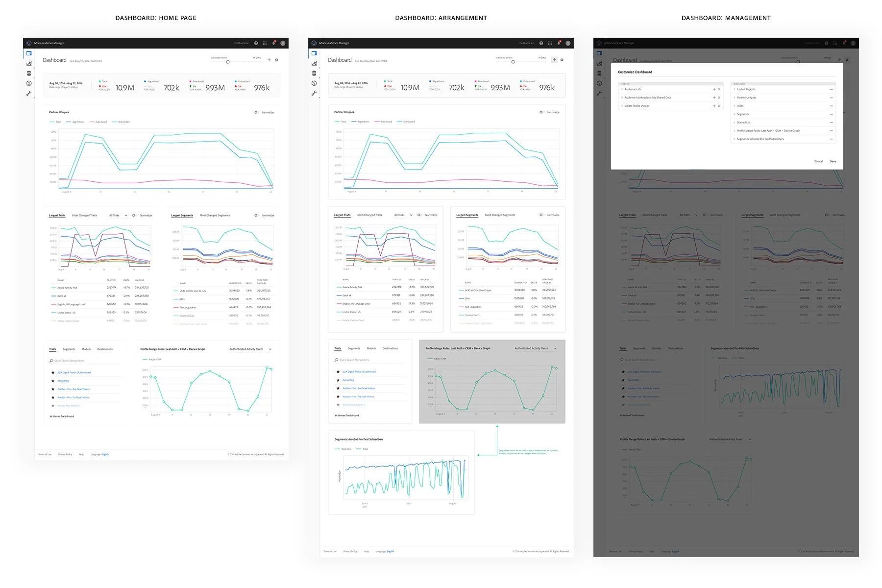
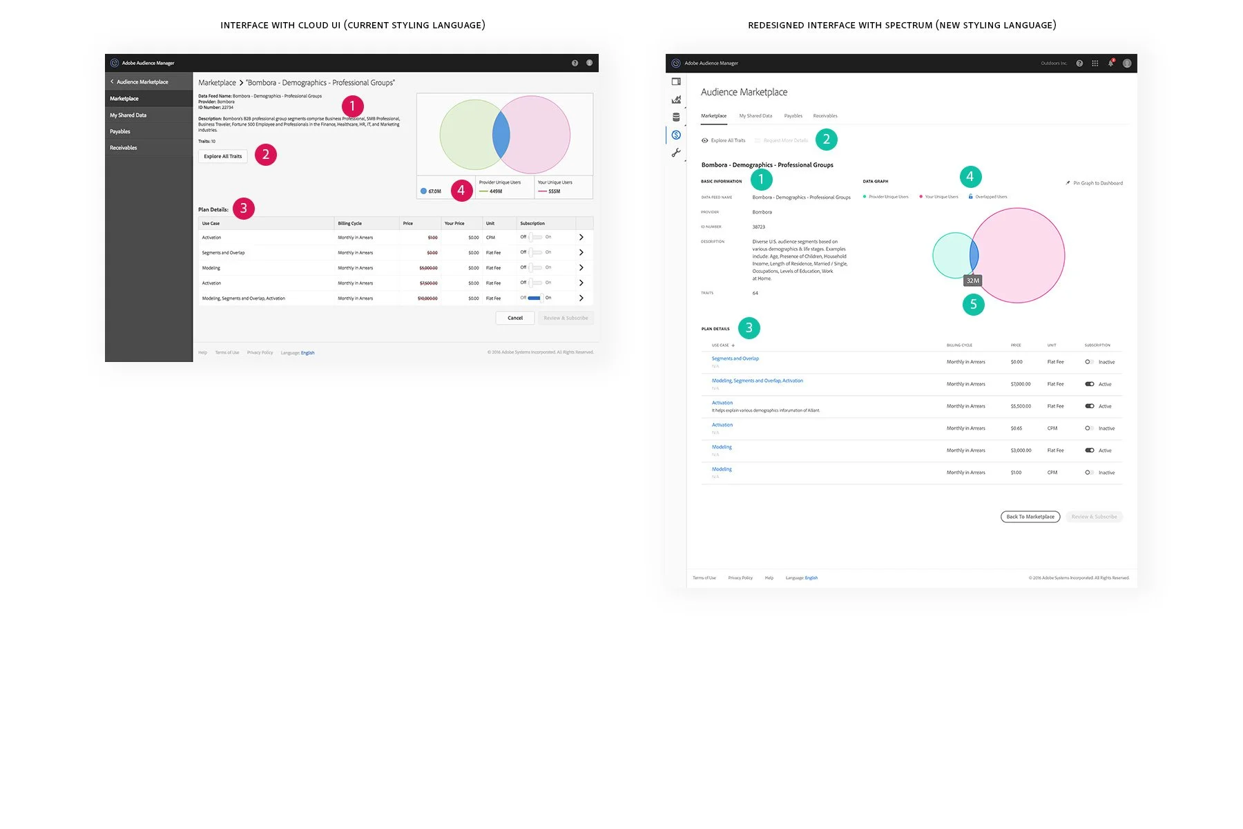
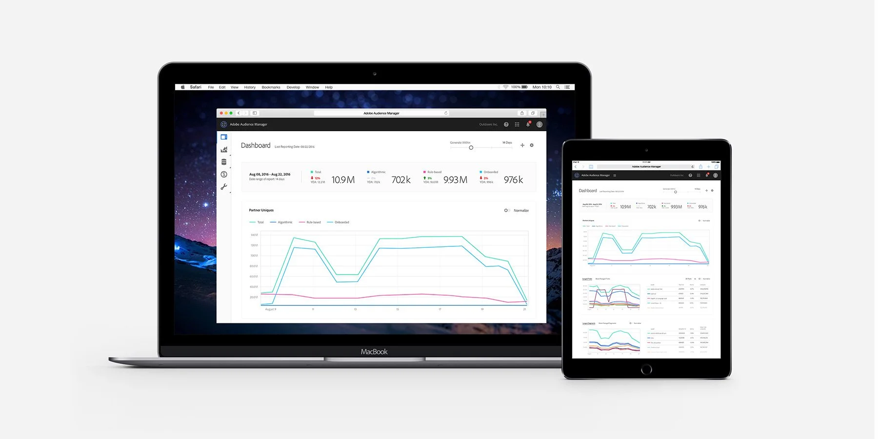
Dashboard Page Redesign
The current Dashboard on AAM only displays total unique data, and the summarized data of traits and segments, which is quite restricted and functionless. To expand its functionality, we decided to give more functions with user customization. The "Pin to Dashboard" options are given to certain data and graph sections to allow users to instantly check on the latest info through the dashboard page. Also, the "Arrangement" and "Management" buttons also allow users to customize their own dashboard page based on their preferences.
Improvement on Interfaces
Meanwhile, there are lots of sections that have been visually upgraded with the Spectrum based on the style guide.


To Be Continued…
In terms of creating responsive versions for portable devices such as tablets and mobiles, Tim and I both think this should not be the priority design concern for Audience Manager at this stage since most of the users are accessing this software via laptops. However, in the long run, the platform of this software will be extended to portable devices, especially tablets. Therefore, responsive versions are still pending to be designed.
Lastly, I would like to credit Tim again for being my mentor along with my internship at Adobe. I have learned a lot from his feedback and his perspectives on design, which have expanded my visions and made me start being interested in experience and product design.
That’s a wrap for now. Thanks for reading!