The UI design in HSBC digital products is complicated with its own branding, existing patterns, and accessibility standards. In order to provide everyone with pleasant visual experiences, as a UI designer specializing in the team, my role was to help design UI in the products, document UI components in legacy products, as well as create visuals such as new UI patterns, icons, and illustrations to fulfill and align with HSBC’s latest visual styles.
HSBC UI Design
UI Design
2018 - 2022


User interface (UI) design in HSBC is to design interfaces focusing on the looks or style. In this case, with the overall design layout on each screen, my work also covers 4 major elements.
Patterns / Components
Data Visualization
Illustrations and Pictograms
Icons and App Tile Design
1. Patterns / Components
For the component used on each screen, there are various methods and approaches in terms of the UI design in HSBC digital products.

Improvement
Making changes in the existing component in order to enhance the visual experience

Alignment
Ensuring component design and usage are consistent across products (extending to different variations if necessary)
Documentation
Filing the thoughts of a pattern with the component’s specifications in proper documentation

Creation
Coming up with new ideas to strengthen the HSBC Design System in digital products
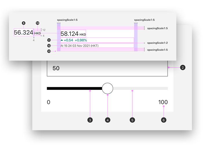
2. Data Visualization
Data Visualization components and patterns are essential in banking products, especially for the Wealth Design team. My role allows me to participate in a team to design data visualization used in the HSBC app and web products. With a series of engagements with the Design System Guild (a team being responsible for the design system in HSBC), there are designs created to cater to the needs of products, design system alignment, and heavy accessibility considerations.

3. Illustrations and Pictograms
To enhance the visual experience in the digital products, illustrations and pictograms are used to please our customers by providing a “friendly” experience, and visual breaks between contents.

Illustration examples

Pictogram examples

Illustration and pictogram examples (in latest guidance)
4. Icons and App Tile Design
Based on the existing icon system, I also have helped create additional icons and app tile designs to cater to the needs of wealth digital products.
Addition: Animation
The team did aim to push motion to enhance the experience. However, the animation got lower priority due to the budget limitation in project scopes.
Sample animation for FlexInvest
How do we maintain our UI design?

UI Consultation
There will be 2 sessions in a week opening for our wealth designers to submit a slot booking for the QA in terms of the UI area. I will be one of the designers to provide feedback and directions in terms of correct UI usage and UI alignment across wealth products.

NPR Catch-ups
We have a bi-weekly session with UI designers to follow up with our UI tickets in terms of NPR (New Pattern Request). In the session, I will also be able to comment to ensure high-quality NPR submissions.

Design Clinic Sessions with DSG
We have a weekly session called Wealth Design Clinic with DSG (Design System Team) to have opportunities to engage the Design System team for more feedback, guidance, and direction with our designs in terms of the UI new pattern and UX logic.
Questions
What is my design process?
Any challenges for UI Design in HSBC?
Any FAQs from fellow designers?
My UI Design Process

Research
I would usually go through materials for UI research by various approaches.
Google Material Library
Apple Human Interface Guidelines
Competitor Analysis
Inspirations (from books, social media platforms, and websites)
Exploration
There will be various design attempts for explorations. I would usually consult with UI/UX designers for feedback before bringing it for a deeper discussion in our internal reviews.
Prototype
With choosing one (or two for A/B testing), I will try to mock up UI on the screen design to see how it looks holistically.
Validation
When there is a time for the user testing session, we would include visual-related questions to our testers for their feedback. For example, what they would prefer in the A/B testing, and what is the EBI (Even Better If) of the page in terms of the layout and visual hierarchy.
Sign-off
While I am making a high-fidelity prototype for testing, I usually start reaching out to designers from DSG for further discussion in order to receive an NPR approval. It will cover how it is aligning with the existing design system, any solution for a replacement with existing components, and accessibility considerations (if any).
UI Design Challenges in HSBC
There are some problems and challenges based on my observations:
Source of truth to follow the UX logic and UI patterns
As a UX/UI designer in wealth, I often face challenges to find an up-to-date file for a particular product and a designer who I can reach out to understand the logic behind it. With the tribe structure and upcoming Figma usage, I hope a designer would be able to find the most updated version of the file, and the correct contact person for more information.
DSG's role in our design process
We, especially for us working as UI designers, need to be able to define if a change needs to submit an NPR or not. Sometimes, I've seen small changes within an existing component in the toolkit/incubator being brought up to the design clinic with DSG for clarification. Although it's always better to get a confirmation from DSG, it won't be good for us in the long term because we are slowly lacking correct mindsets of UI (and UX as well), and making DSG as our design leads being in charge of the UX/UI. In this case, to avoid being manipulated in a design process, the designer is always better to be able to identify what sort of changes won't be necessarily brought up for the discussion with DSG.
MDL alignment
With the difference in updating speeds between Toolkits and MDL (Mobile Design Library), developers will raise Jira tickets to question the differences in case a difference is considered as a defect from the testing team's perspective. For our role, we can give a comment on the ticket by attaching screenshots of how it looks like in the toolkit, and emphasize the MDL will be updated soon. So that developers can close the ticket with the clarification.
Proper project documentation
Since we have perm designers and contractors, to have a better organization in the workflow, I think it's important to have a system in terms of naming conventions and layer organization. From my experience, a better organization of layer always help me reach the goals of being detail-oriented and pixel-perfect. Therefore, we can reduce the chances of making mistakes and misalignment in the design files. With the upcoming Figma usage, I hope designers can try not to detach "symbol" from the toolkit as much as possible, as it's important to sync up with the latest updates in the toolkits.
FAQs from fellow designers
I asked the designers in our team for questions that they would want to ask me in terms of working in the HSBC and the UI area. Then I hosted a show and tell session to go through it.
Q: Do you have any secret tips for getting NPR approved quickly? (e.g. through research / exploration / solid UI work)
A: I often ask myself about how to persuade DSG for my NPR. With research and attempts of exploration, these steps will help a lot in terms of approval. However, “Reusable” is the most critical point of getting a UI pattern. The more you have a vision of how your NPR can be used in other situations, the more possibility your NPR will be worth being documented in the incubator.
Q: It'll be good to let us know the ways/tips of getting the approval for 1) system icons, 2) illustrations, and 3) design patterns?
A: With an established design system (still a long way to go, but I would say it for now)… It’s always better to reuse/create more UI components (e.g. UI patterns, icons, and illustrations based on the existing components. Putting yourself in others’ shoes, people who created the toolkit don’t want to see what they have created is completely wiped out. Instead, they’re more delighted to see how you use their stuff to transform it into a better way. For my creative process, before making something completely new, I always try to see what I can reuse from the existing resources to build something for my needs. (I can even say our components are like Lego bricks, we can always do a mix-and-match to build different possibilities.) More importantly, I would consider these existing legacies help us save time from starting from scratch. Instead, these give us directions to speed up our design process in order to build new stuff to develop our design system.
Q: Are there any secrets on how to convince multiple markets’ stakeholders to align on decisions?
A: Time is the most critical factor to convince the business or other parties to align with what we already have. WDR > DSG > Design Council are the back-ups for your directions. These platforms give you blockers from the design process sometimes. However, these also give you the power to convince them with the authorities of design approvals. For example, I would always tell businesses if we go differently, it might take 3 months or more to have a sign-off including the research time, and many back-and-forth processes. With all these complexities and complications, stakeholders would usually just give up.
Q: Where is the best place to look for UX/UI suggestions as I found create.hsbc usually falls a little bit behind the actual toolkits & design decisions?
A: I often see UX/UI-related posts on Instagram and LinkedIn. Believe it or not, that kinda keeps me in a loop of the latest trending in the field. Other than that, Medium and mobbin.design are the places that I would consider getting some inspiration from.
Q: What is the biggest challenge when you working on designing/executing creative ideas in HSBC?
A: I found “creative” is something more than starting from starch. The limitations can be considered as directions to help you create things that are balancing feedback and considerations from all stakeholders. In another way, this is creative by completing the challenge.
Q: How to understand the padding/spacing things for table designs on the browser?
A: Bond HK can be a foundational reference for the spacing, including the comparison table. For other spacing info, there is a “Form Snippets” page that allows me to follow the spacing system.
Q: How do you keep up with the latest updates on spacing/padding etc on WD designs?
A: Check out the Zeplin page for basic info. The rules should be following the toolkit mostly. If you’re still unsure about it, you can group all of your questions and ask the designer about the product.
Q: Any shortcuts/cheatsheets that you follow during UI designs?
A: Being systematic, organized, and detail-oriented are essential skillsets for a UI Designer. The more you focus on these details, the more you can memorize all the stuff you used in products such as component usage, UX logic, alignments, etc.
That’s a wrap for now. Thanks for reading!